
Creating a World in a Box: Exploring Perception through Art and Design
“If the doors of perception were cleansed every thing would appear to man as it is, Infinite.” — William Blake
Inspired by my short story, Color Imprints, Petals in the Shadows, is a set design project that delves into the transformative power of perception. The story follows Seline, a young woman navigating a gray, lifeless city, burdened by her disillusionment. Her journey serves as a reflection on how fleeting moments of connection, creativity, and self-discovery can unveil hidden beauty in even the dullest landscapes. Through this project, I sought to translate these themes into a tangible, artistic form.
This blog will guide you through my creative process, from initial research to the final design, exploring the inspirations, challenges, and techniques.
Research & Development: Building a Visual Language
I drew from several artistic and architectural influences to capture the juxtaposition of Seline’s disillusioned world and her inner potential for vibrancy. German Expressionism played a significant role, with its stark contrasts and exaggerated forms that evoke emotional resonance. Brutalism's harsh, angular aesthetics informed my approach to the cityscape, emphasizing rigidity and lifelessness. Marcel Duchamp inspired the interpretation of the crowds in the shadows, focusing on how unconventional forms and textures disrupt perceptions.
Lyonel Feininger’s attention to asymmetry, textures, and leading lines inspired the set’s visual composition, while Yoshitaka Amano’s ethereal, dreamlike illustrations guided my portrayal of Seline’s contrasting reality. These influences allowed me to weave a narrative of tension and transformation into the design.


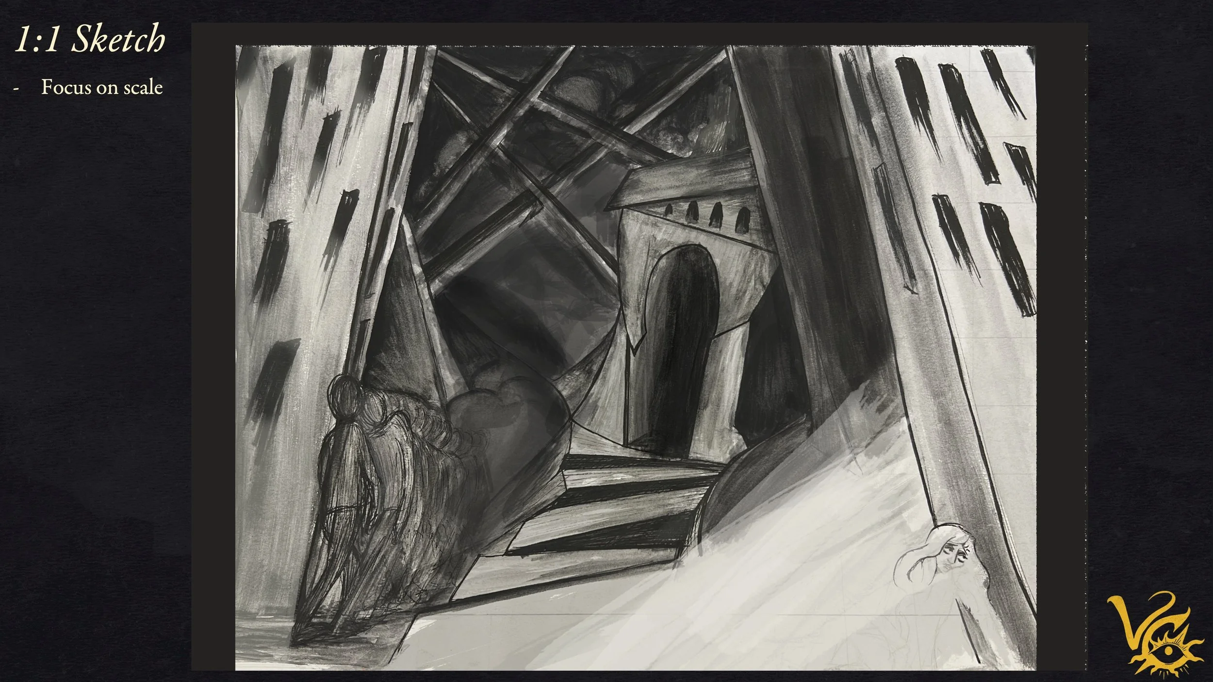
Sketches and Maquettes: Bringing the Box to Life
Starting with sketches, I focused on creating a visual narrative that captured the tension between Seline’s gray, oppressive world and her inner potential for growth and beauty. Key compositional elements included asymmetry, frame within a frame, and leading lines, all designed to guide the viewer’s eye through the scene.

Maquettes: Thinking in 3D
I think better in 3D than on paper, so maquettes are essential to my creative process.
First Maquette: This was all about experimenting with scale, proportion, and composition. By building a physical model, I could better visualize the relationships between elements in space and refine how the foreground, middle ground, and background interact to create depth.
Second Maquette: I transitioned to working directly within the box I planned to use for the final set. Using my 1:1 watercolor sketch, I cut out and rearranged pieces to explore the layout and measurements. I began experimenting with the box itself, removing the screws holding it together, flipping the lid upside down to use as the floor, and rotating the box to create a more dynamic composition.

Final Render
My final render, a quick Photoshop sketch, helped me visualize the environment in 3D and make key adjustments. To avoid plain shapes, I refined the silhouettes of the buildings in the foreground, giving them more visual interest and character. The door, representing the portal in Seline’s story, became a pivotal element in the composition. Her silhouette in the doorway symbolizes the threshold between gray and color—her transformative journey and the moment where she stands between two worlds.
Seline's pose was the main significant adjustment from the render to the final design. Initially facing outward, I rotated her inward to guide the viewer’s eye deeper into the scene, emphasizing her continued blindness to the color emerging from her. This subtle change reinforced her inner conflict and the story's overarching theme.

Another significant change in the design came with the rendering of the vines and flowers. Initially, these elements had strong contrasts, but I realized they competed with Seline as the piece's focal point. To maintain her prominence, I opted for a subtler approach by reducing the contrast and incorporating a gradation of color into the vines. The gradual color in the vines mirrors the idea that beauty and vibrancy begin within Seline, radiating outward as she progresses on her journey. This subtle detail connects her inner growth to the world around her, seamlessly connecting the environment and character.
Seline: Character Design
To shape Seline’s unique look, I drew from sources like Kate Baylay’s whimsical illustrations and the theatrical elements of German puppetry. These influences brought a sense of drama and stylization to her costume, aligning with the set’s exaggerated, surreal aesthetic.
I envisioned Seline wearing layered clothing with textures that echoed her emotional guardedness. The combination of Edwardian elegance, 1920s flair, and modern practicality emphasized her complexity as a character.


The Process: Crafting Petals in the Shadows
Bringing Petals in the Shadows to life required careful planning, experimentation, and hands-on construction. Each step was an opportunity to refine the relationship between the set, the character, and the story’s themes.


Check out the final photos by clicking the image!
Thank you for taking the time to explore my creative process, this project was a journey of experimentation and discovery, allowing me to merge narrative, design, and craftsmanship into a cohesive piece. I hope it inspires you to look closer at the connections between story and art and how even fleeting moments of beauty can leave lasting imprints.